Introduction to Flexbox
Oftentimes we want to align elements on a page side by side as opposed to just vertically down. This is a bit of a challenge at times without an effective strategy to help us. The flexbox strategy is a method of aligning and distributing items in a container even if their size is unknown and/or dynamic. It is one of several strategies of laying out div content on an HTML page (another popular one being the grid strategy)
The main idea behind the flex layout is to give the container the ability to change its items’ width, height, and order in order to fill the available space. A flex container expands items to fill the remaining free space or conversely shrink them to prevent them from overflowing from the container itself
From now on, when you plan to align items, you will use the following strategy:
- Create a flex container
- Add properties to the flex container to satisfy your alignment requirements
- Create flex items inside the container
How to use Flexbox
The flexbox strategy makes use of two components:
- Flex container: the
divsurrounding the items to be aligned - Flex items: the items to be aligned
Adding properties to either the container or the items allow us to achieve the desired behaviour we want. We will go over the very basic flexbox properties (although there are more that may be useful in more complicated use cases)
Flex container properties
To setup a flexbox, we can setup a container div with the CSS property flex as follows:
.container {
    display: flex;
}
From here, we can add various properties to the container as we wish
flex-direction: define the direction the items in the flex container go
.container {
    flex-direction: row;            /* default order (left to right) */
    flex-direction: row-reverse;    /* right to left order */
    flex-direction: column;         /* top to bottom order */
    flex-direction: column-reverse; /* bottom to top order */
}
Example (using flex-direction: column):
<div style="display: flex;
            border: 1px solid grey;
            padding: 15px;
            flex-direction: column">
    <div style="width: 50px; height: 50px; background-color: red"></div>
    <div style="width: 50px; height: 50px; background-color: blue"></div>
    <div style="width: 50px; height: 50px; background-color: green"></div>
</div>
flex-wrap: determine what happens if the flex items overflow
.container {
    flex-wrap: nowrap;          /* default (all items on the same line */
    flex-wrap: wrap;            /* wrap onto mutliple lines from top to bottom */
    flex-wrap: wrap-reverse;    /* wrap onto multiplie lines from bottom to top */
}
Example (using flex-wrap: wrap):
<div style="display: flex;
            border: 1px solid grey;
            padding: 15px;
            flex-wrap: wrap">
    <div style="width: 40%; height: 100px; background-color: red"></div>
    <div style="width: 40%; height: 100px; background-color: blue"></div>
    <div style="width: 40%; height: 100px; background-color: green"></div>
</div>
There are additional properties for the flex container you may find useful here
Flex item properties
order: determines the order of which the items are laid out; by default, they are ordered in the order in which they appear
Example (the blue square is the second div but comes before the red)
<div style="display: flex;
            border: 1px solid grey;
            padding: 15px;">
    <div style="width: 40%; height: 100px; background-color: red"></div>
    <div style="width: 40%; height: 100px; background-color: blue; order: -1"></div>
    <div style="width: 40%; height: 100px; background-color: green"></div>
</div>
flex-grow: defines the “proportion” an item should have; allows an item to “grow” to fill the space if necessary; by default, all items have flex-grow set to 0; think of the flex-grow number to be the “percentage” of the container the item is allowed to have
Example (notice how the blue div is 3 times the size of the other two):
<div style="display: flex;
            border: 1px solid grey;
            padding: 15px;">
    <div style="height: 100px; background-color: red; flex-grow: 1"></div>
    <div style="height: 100px; background-color: blue; flex-grow: 3"></div>
    <div style="height: 100px; background-color: green; flex-grow: 1"></div>
</div>
There are additional properties for the flex item you may find useful here
Exercise
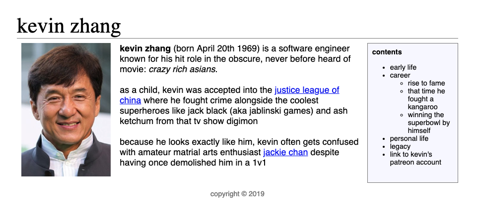
Create a Wikipedia-style page about yourself. The page must contain the following pieces of content:
- A header at the very top that spans across the page
- Add a line on the bottom of this using
border: 1px solid blackto make it look similar to Wikipedia and make the fontserif
- Add a line on the bottom of this using
- An image depicting yourself (doesn’t have to be an “actual” image of yourself) aligned to the left side of the page
- The content aligned in the center of the page
- Make the font
sans-serif - Add some fake links to make it look similar to Wikipedia
- Write a fake Wikipedia entry about yourself
- Make the font
- A sidebar containing all the fake sections of the Wikipedia article aligned to the right side of the page
- Make the font
sans-serif - Make some fake sections using an unordered list
- You do not actually have to write out all the sections
- Make the font
- A footer at the bottom containing the copyright date
- Make the colour
grey - Reduce the font size (with respect to the other fonts)
- Center align the text
- Make the colour
In the end, you should have something that looks something like this:
References
- Flexbox strategy
- Grid strategy
- Check this out too if you find flexbox difficult to understand; it’s also a widely used strategy